Saisei Flow Data
The diagnostic tools are available under the “Saisei Graphs” portion of the account (it is also available under the account’s equipment).

Saisei Graphs
The first graph will show the traffic from the specific applications (such as microsoft or netflix). You can hover over the graph to see the breakdown at a given time.
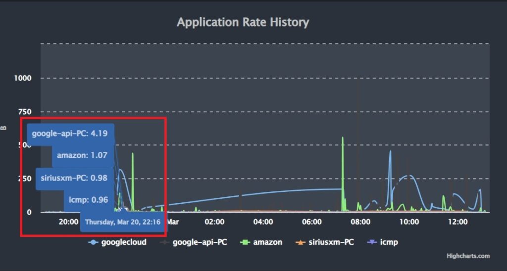
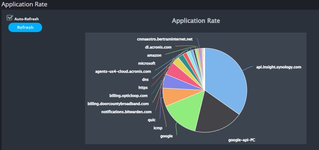
The 2nd graph will show the total traffic. The 3rd pie graph shows a live representation of what percentage of their current usage is being used by a particular application.
Below the pie graph you will see the flow data which represent the various applications. Generally you will see multiple instances of the same application which is normal. If a particular application is having issues it will show the Distress rate as a percentage of dropped TCP packets. If you only see a few entries, especially if it is just cnmaestro & icmp then that is likely just the radio communicating with onPrem.
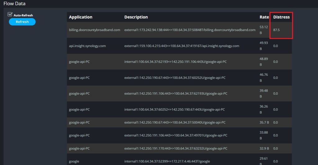
What Does Distressed Mean
A high distressed score doesn’t mean that there is an issue with the customer’s internet connection from us unless many different applications are showing a high distress level. Instead, if there is an issue with a given application it can be either an issue with that application’s given servers or the path on the public internet that leads to those servers.
No comments to display
No comments to display